RCA Typography Short Course
I had the opportunity to enrol in a 4 week online typography short course at the Royal College of Art.
Below is a selection of work produced whilst on the course as well as some screenshots of my references and thinking behind the work.
Below is a selection of work produced whilst on the course as well as some screenshots of my references and thinking behind the work.

Week 1: The designer Alan Fletcher famously noted that there was always a number of different and viable solutions to any design brief.
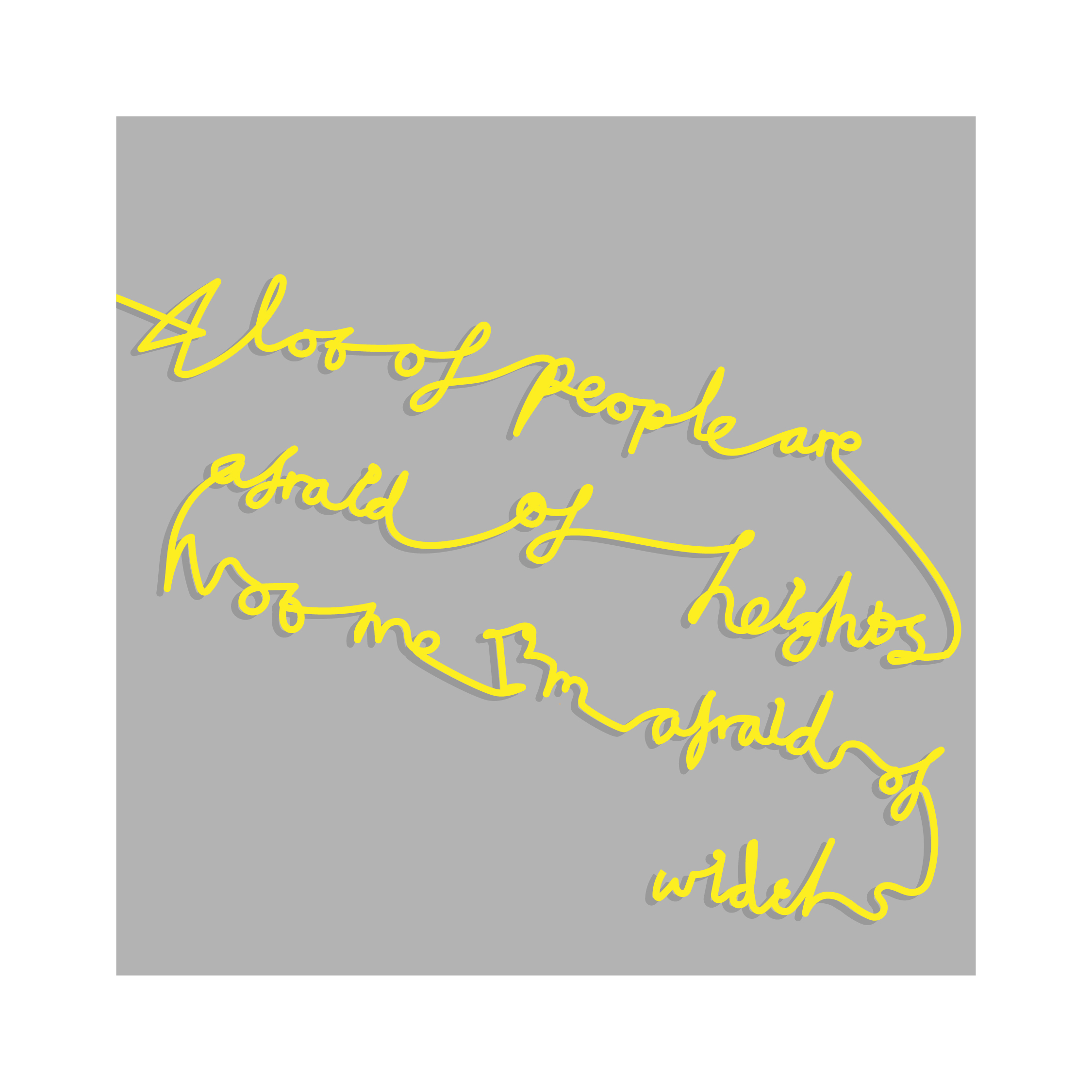
The first brief was to see how many different and viable iterations we could make type that enhances or increases our understanding of the phrase:
“A lot of people are afraid of heights. Not me, I’m afraid of widths.”
I chose to play with the idea of width and height, quickly creating layouts which exaggerated both.


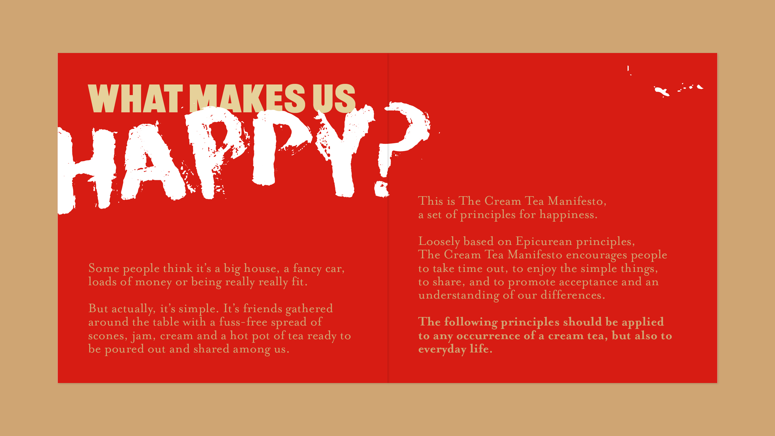
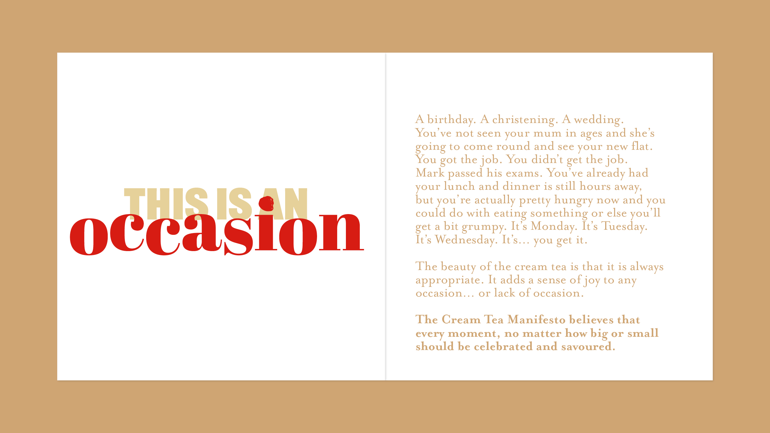
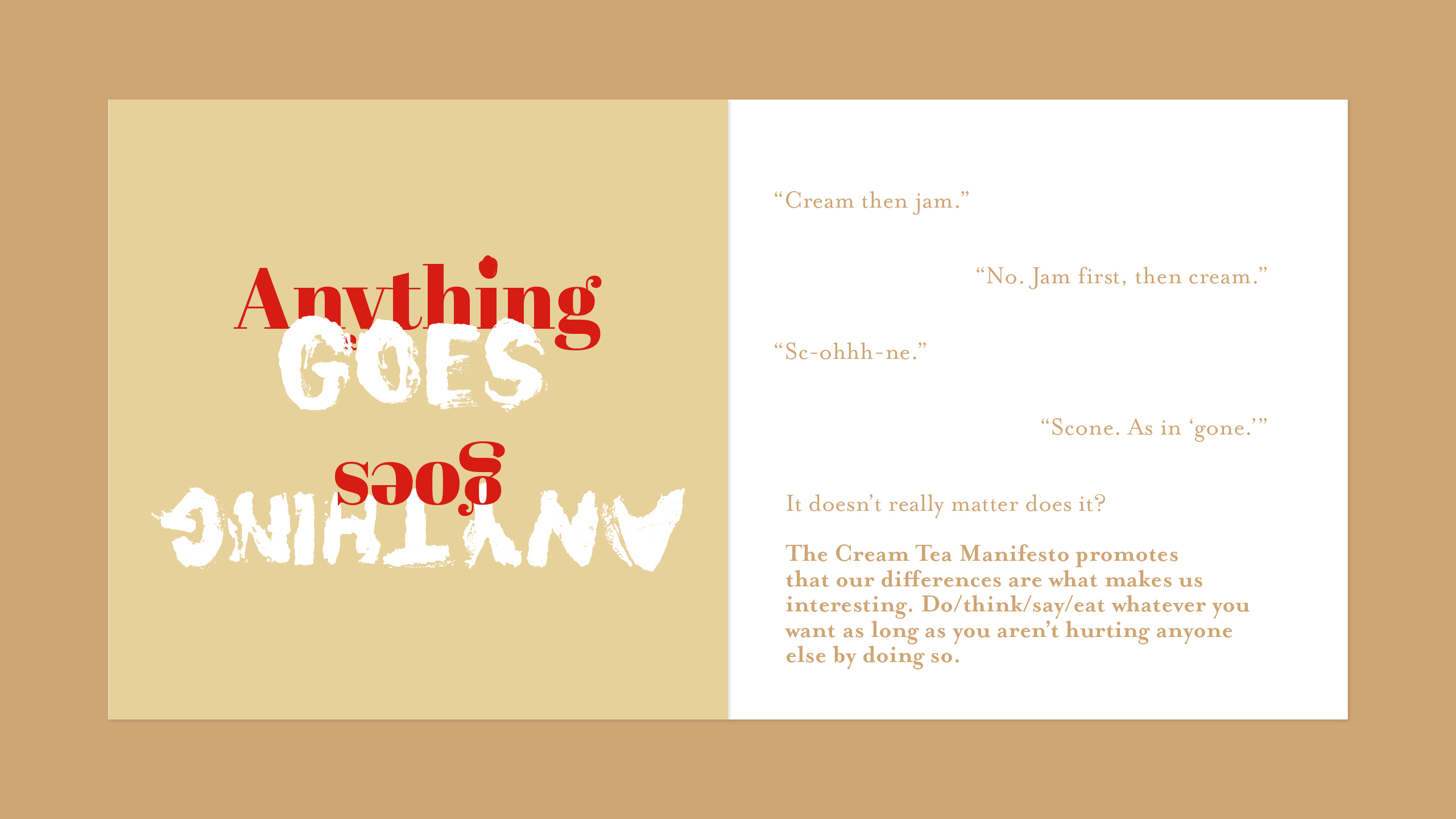
Week 2: Write and design a manifesto.
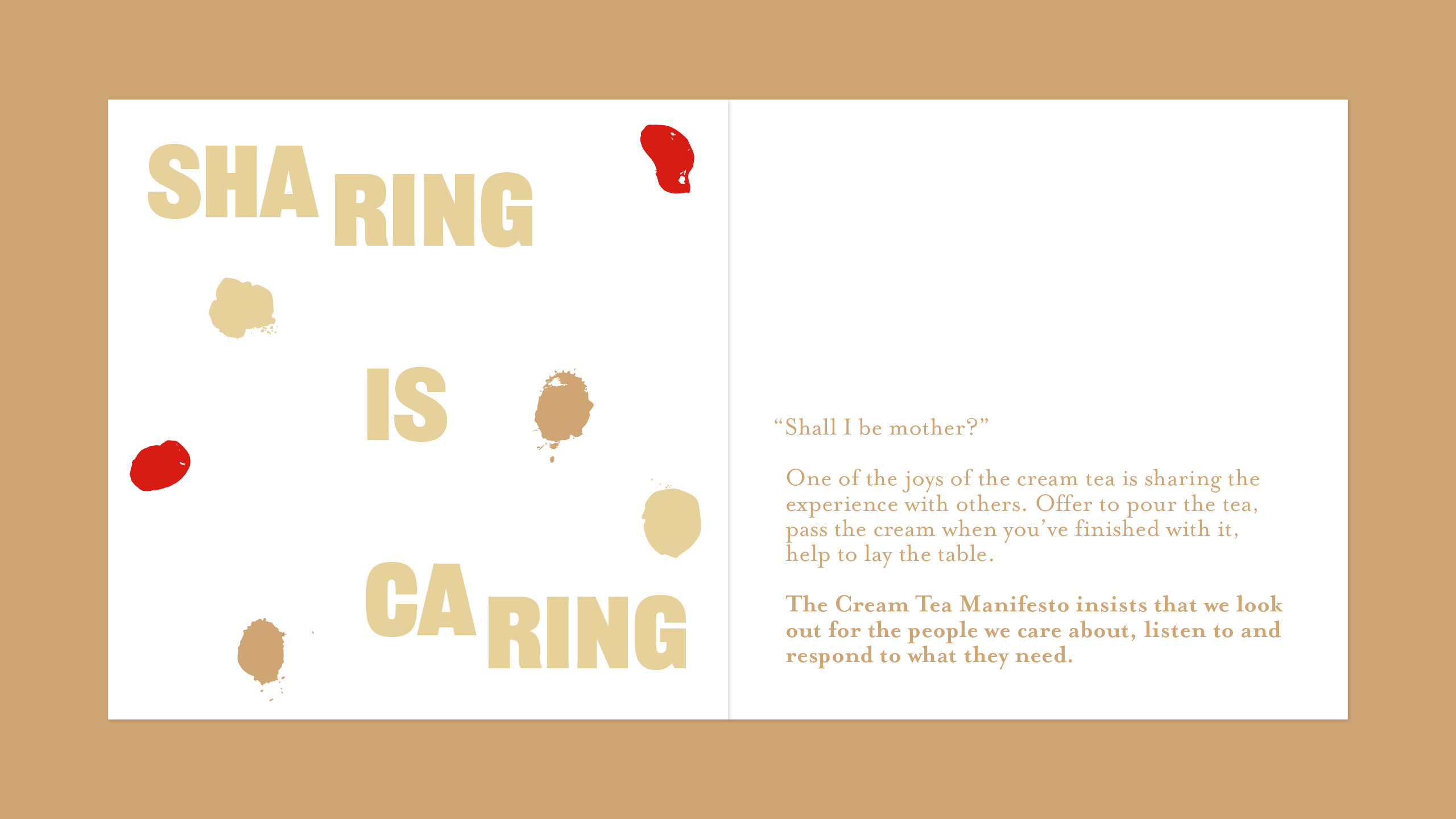
I chose a light hearted approach, and set about trying to encourge a positive way of living through the principles of a cream tea.
I created my own ~creamy~ typography for an anarchic tone of voice that was at odds with pre existing ideas of what an afternoon tea should be, trying to get across the idea that the cream tea is for everyone, not just for fancy team rooms.


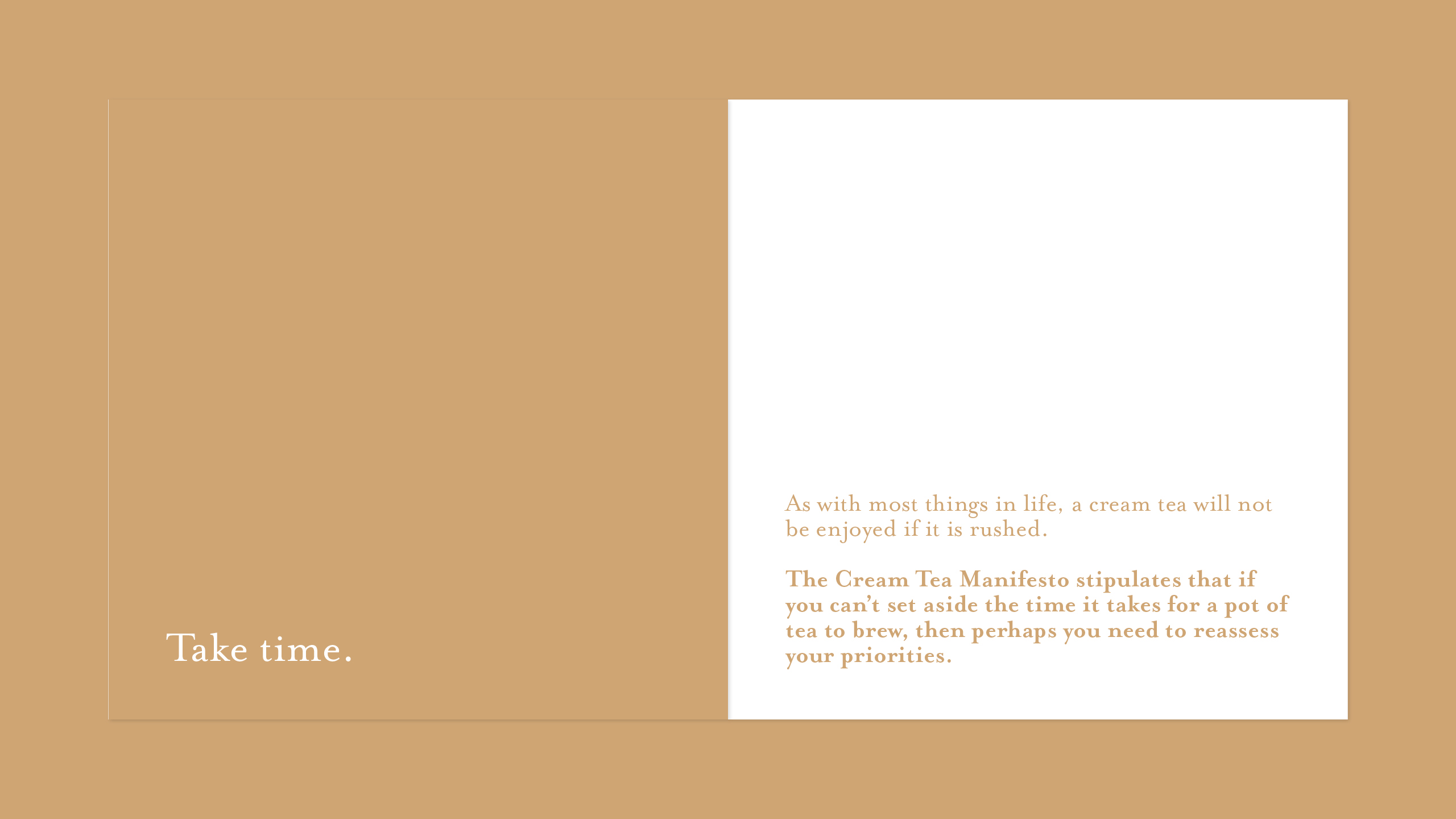
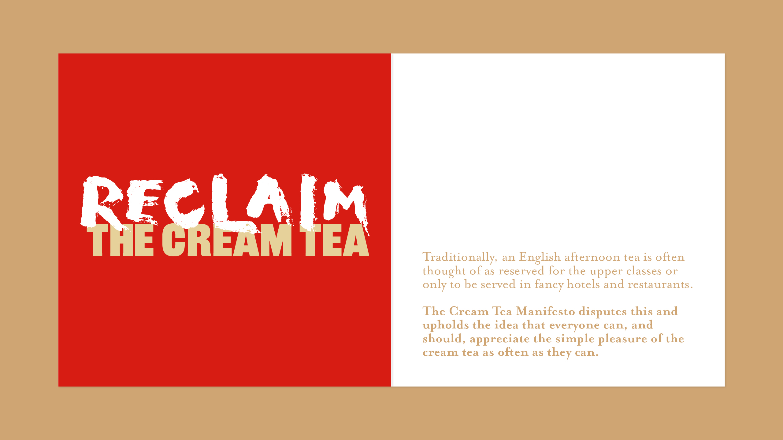

Week 3/4: Develop your manifesto.
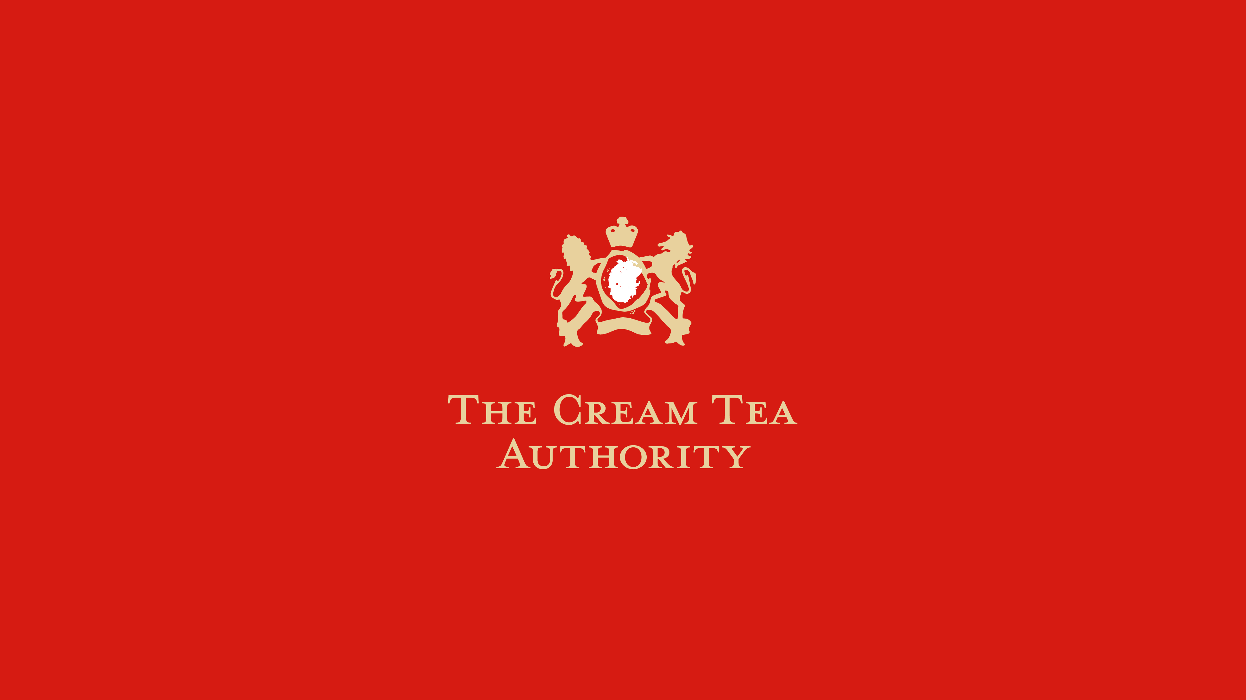
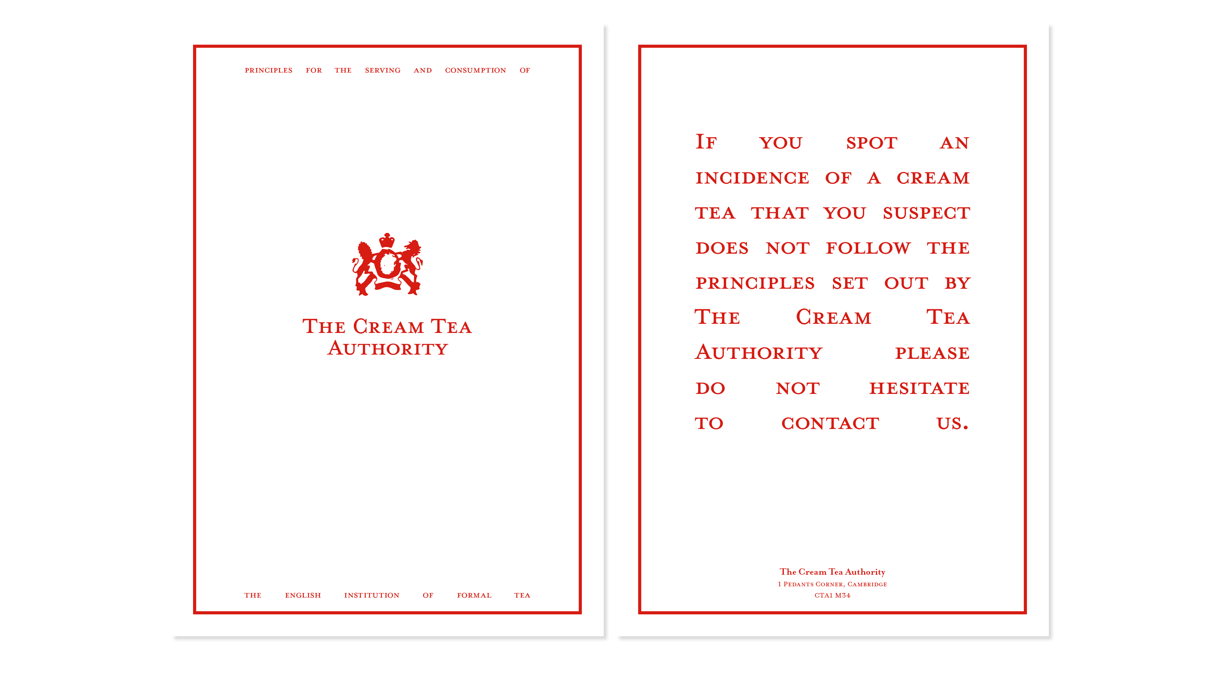
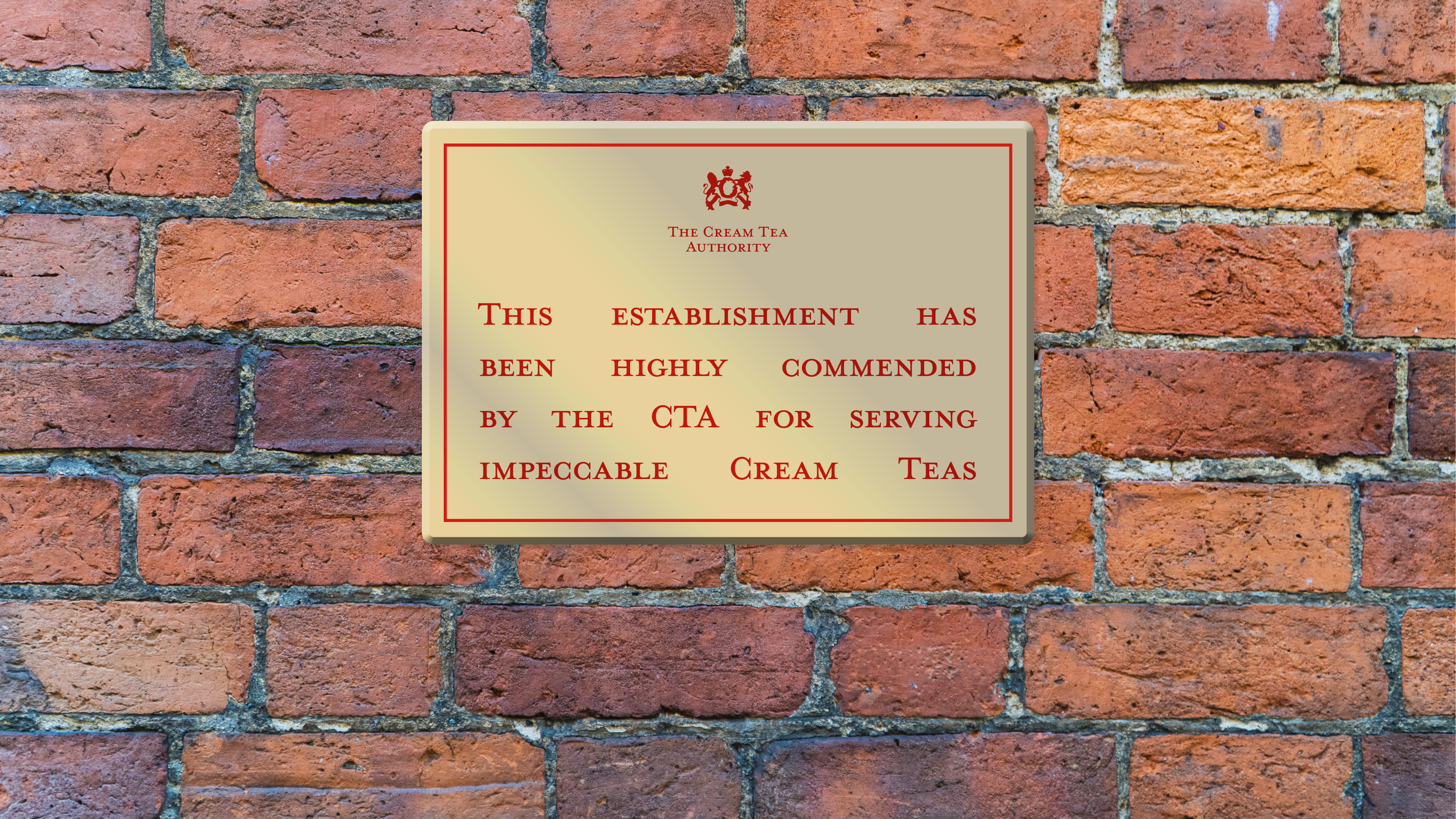
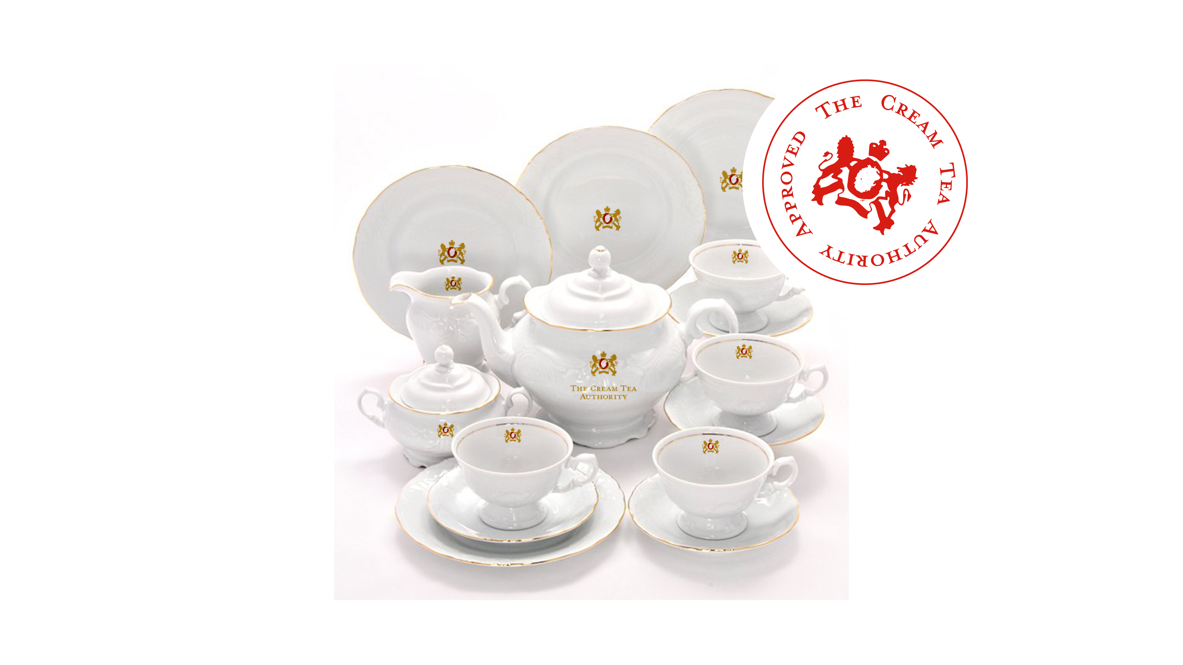
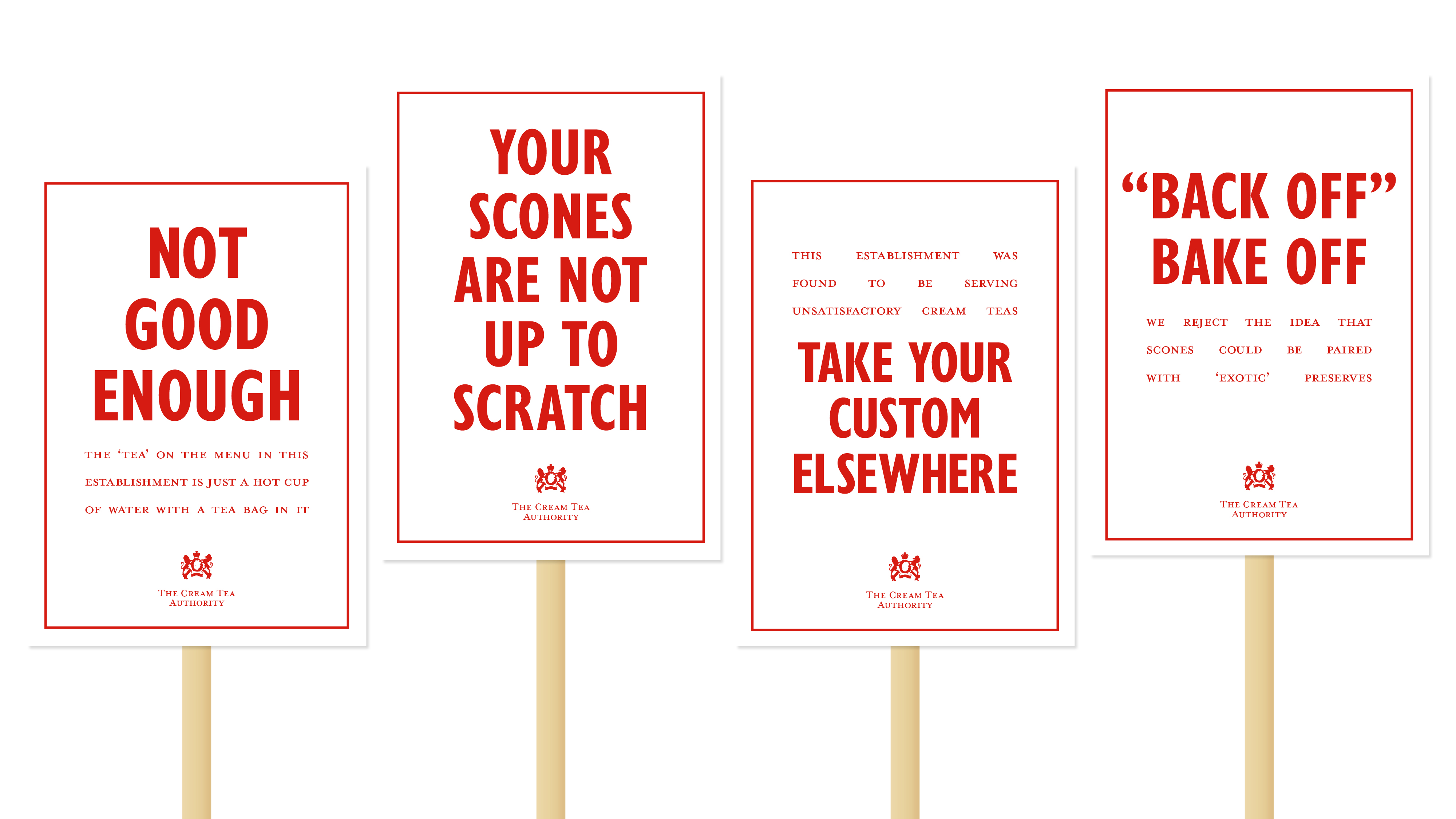
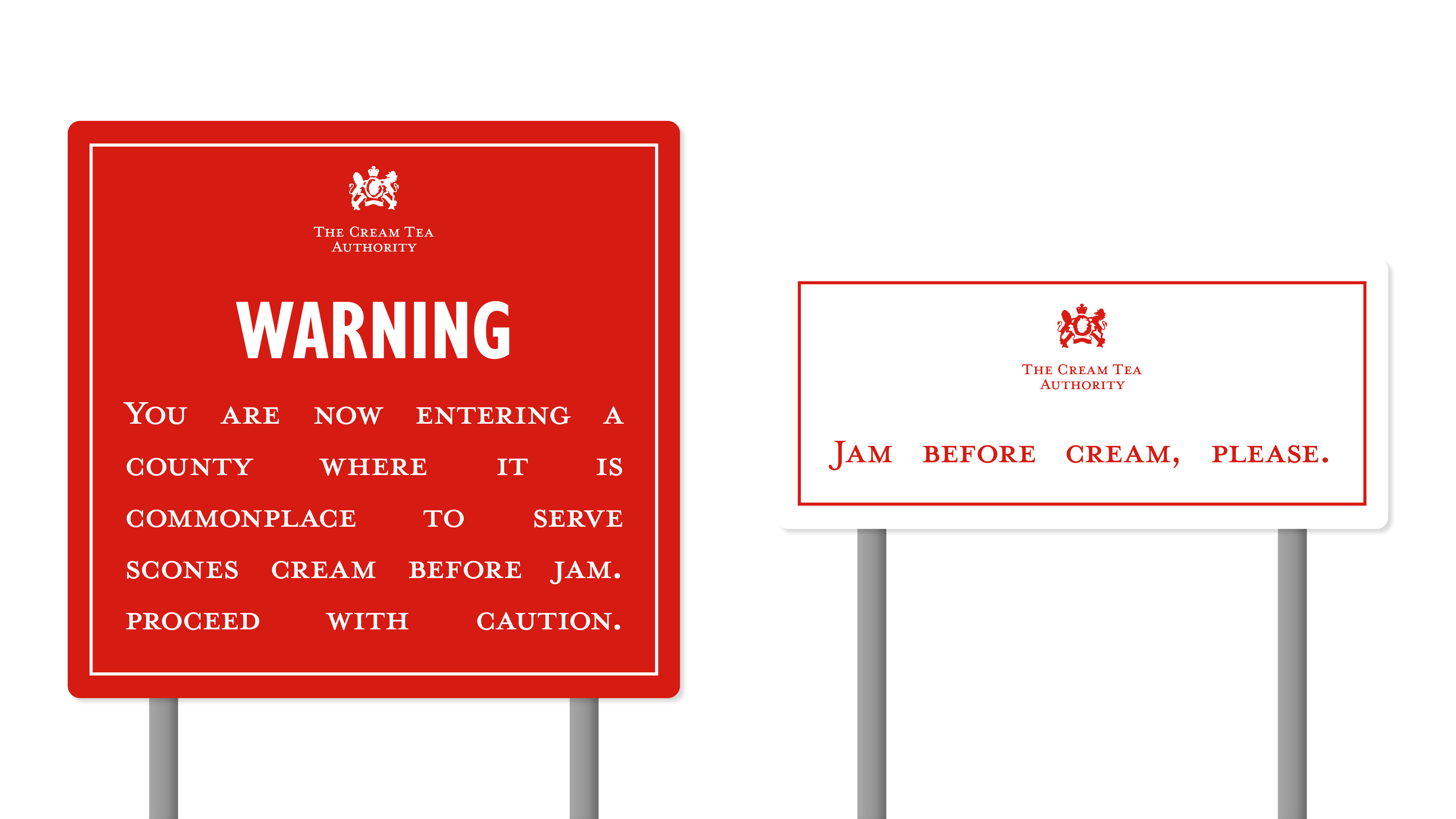
After recieving critique that I was trying to communicate too many things in one concept, I decided to change track and build the world of the fictional Cream Tea Authority; a mysteriously funded group that inspects the serving of Cream Tea and passes judgement.
Typographyically I chose to take things to the traditional extreme (perhaps too far in places!). It was really fun to take a silly concept very seriously.